Wikipedia defines business intelligence as "the strategies and technologies used by enterprises for the data analysis of business information. Common functions of business intelligence technologies include reporting, online analytical processing, analytics, data mining ...predictive analytics and prescriptive analytics." We can quibble about the nuances, but I suppose that's as good a definition as any. One of the things you'll notice is that there are a wide variety of functions within the scope of business intelligence. Just like someone saying they're a doctor doesn't tell if you if they're a brain surgeon or podiatrist; someone telling you they work as a business intelligence developer / professional / architect doesn't really tell you what they do every day when they go to work.
My passion is data visualization; bringing order out of chaos by helping users visualize data - i.e. creating reports, charts and dashboards that clearly communicate meaning- is incredibly gratifying. As Stephen Few says "We are overwhelmed by information, not because there is too much, but because we haven't learned how to tame it. Information lies stagnant in rapidly expanding pools as our ability to collect and warehouse it increases, but our ability to make sense of and communicate it remains inert, largely without notice. Computers speed the process of information handling, but they don't tell us what the information means or how to communicate its meaning to decision makers. These skills are not intuitive; they rely largely on analysis and presentation skills that must be learned."
How important is the right visualization? Let's say your goal is to understand which of your company's six products has the most sales. You try breaking down sales via a pie chart. (left two images) As you can see, if the percentages are relatively close, it is very difficult to tell which product comes out on top. So you try putting the products side by side on a bar chart and ordering the bars from highest to lowest. (right image) Bingo! Now, even though the percentages are very similar, you can easily tell which is highest.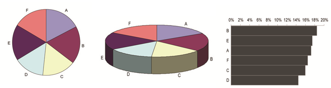